Number style for web editors: accessibility, UI and a ready house checklist

Spell out zero to nine, switch to numerals at 10, and treat that as the default rather than the law. Percentages, currency, measurements, dates and times always take numerals, regardless of size. The rule that actually matters more than any cutoff is consistency: pick one system, document it, and apply it the same way on every page.
TL;DR:
- Numerals are required for percentages, currency, measurements, dates, and technical scores regardless of size, while consistency in style is crucial.
- Most style guides recommend spelling out zero through nine and switching to numerals at ten, but exceptions depend on context and audience.
- Large or precise numbers, such as measurements and technical data, must always be formatted as numerals to ensure clarity and accuracy.
- In web content and interfaces, use numerals for scanability and accessibility, avoiding superscripts or unconventional formats that hinder screen readers.
- Establish and document clear number style rules that reflect your audience, content type, and accessibility needs to maintain consistent and trustworthy formatting.
Table of Contents
- Quick decision rules: a number style guide cheatsheet for editors
- When numerals are non-negotiable
- Ordinals, fractions, ranges, and decimals: the formatting details
- Numbers on the web: accessibility, screen readers, and localisation
- How to choose and document a house style for numbers
- Style for phone numbers, addresses, and identification numbers
- Scientific and technical notation styles
- Why consistent number style is worth the effort
- Catching inconsistent numbers before readers do
- Where to check the original rules
- Sources
Quick decision rules: a number style guide cheatsheet for editors
Most professional style rules share the same backbone. The differences show up at the edges, which is exactly where editors waste time second-guessing themselves.
Here’s how the major camps split:
- Journalism (AP-influenced style): spell out one through nine, use numerals from 10 up, with exceptions for ages, addresses and dimensions.
- Academic writing (APA): numerals for 10 and above, words below 10, but numerals also apply to anything preceding a unit of measurement.
- Technical and engineering documentation: numerals almost everywhere quantities are involved, because precision and scanability outrank prose elegance.
- Literary and general trade publishing: some houses spell out numbers up to 100, reserving numerals for dates, statistics and technical detail.
Most professional guides for US audiences default to spelling out zero through nine and switching to numerals at 10, which makes that the safest starting point if you have no house style yet.
Applied to real sentences, the pattern looks like this:
- “She has three cats.” (below the cutoff, spelt out)
- “The warehouse holds 24 pallets.” (above the cutoff, numeral)
- “Nine out of 10 editors agree.” (mixed sentence, numeral wins for the larger figure)
- Headings and captions favour numerals regardless of size, because they’re scanned, not read line by line: “5 Ways to Fix Your Homepage” beats “Five Ways to Fix Your Homepage” for a reader skimming a page.
- Lists follow the same logic. A recipe ingredient list reads better as “2 eggs, 1 cup flour” than spelt out, because cooks scan lists, they don’t read them as prose.
None of these cutoffs is objectively correct. Microsoft’s style guide spells out zero through nine and numerates from 10, while some academic publishers push the literary threshold to 100. Pick one, write it down, and stop relitigating it every time you draft a sentence.
When numerals are non-negotiable
Some categories override the cutoff entirely. Get these wrong and no amount of consistency elsewhere will save the piece.
Numerals are required, no matter how small the number, for:
- Percentages: “5% of readers” not “five percent of readers.”
- Currency: “$8” not “eight dollars” in running copy.
- Measurements and dimensions: “3 metres,” “a 2 by 4 board.”
- Dates and times: “May 3,” “9:30am.”
- Technical values and scores: “a rating of 4 out of 5.”
Numerals are the standard for measurements, currency, and dates even when the value itself sits well below the usual spell-out threshold.
Mixed categories inside one sentence need a single consistent treatment, not a patchwork. If a sentence contains both a small number under your cutoff and a large one, most style guides recommend formatting both as numerals so the reader isn’t jarred by switching registers mid sentence: “The team grew from 6 to 42 people in a year” reads more cleanly than “The team grew from six to 42 people.”
Symbols versus words follow their own logic. Use the symbol (%, $) in tables, data callouts and anywhere space is tight or numbers repeat often. Spell out the unit in prose when the sentence reads more naturally that way, particularly at the start of a paragraph or in a quote. A single article can use both, as long as the choice is consistent within each context, tables get symbols, running prose gets a mix governed by your house rule.
Ordinals, fractions, ranges, and decimals: the formatting details
Ordinals belong spelt out in running prose. Write “first,” “second,” “third,” not “1st,” “2nd,” “3rd.” APA guidance recommends spelling out ordinals rather than using superscript forms, partly because superscript characters render inconsistently and can confuse assistive technology.
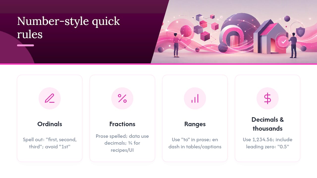
Fractions split three ways depending on context: spell out simple fractions in prose (“a third of readers”), use decimals in technical or data-heavy content (“0.33”), and reserve the fraction symbol (¾) for recipes, measurements or space-constrained UI. Always include the leading zero before a decimal point below one, “0.5,” never “.5”, because a dropped zero is easy to misread as a typo.
Ranges take “to” in formal prose (“from 10 to 15 pages”) and an en dash in tables, captions or data-dense contexts (“10–15 pages”). Don’t mix both conventions in the same document.
Where the industry actually splits: the ONS service manual notes that when a sequence mixes numbers and words, the highest-precision item in that sequence should dictate the format for the whole set, so a series containing “12” formats every entry as a numeral, even the ones below your usual cutoff.
For thousands and decimals, the standard is a comma for the thousands separator and a period for the decimal point: 1,234.56. Consistency here matters more than most editors assume, because a misplaced separator changes the value, not just the style.
Numbers on the web: accessibility, screen readers, and localisation
Superscript ordinals and clever typographic shortcuts look neat in a design mockup and cause real problems once a screen reader has to parse them. Microsoft’s accessibility guidance flags superscript numerals as a source of garbled output, recommending spelt-out ordinals or plain numeral formats instead. If you wouldn’t want a number read aloud strangely, don’t format it strangely on the page.
UI text plays by different rules than prose. Interfaces prioritise scanability, so Google’s developer style guide recommends numerals even below 10 in buttons, labels and tables, and insists on mirroring the exact numeric string shown in the product rather than rewording it. If the interface says “3 items left,” your help copy should say “3 items left,” not “three items.”
Localisation adds another layer. Spell out month names in international content (“3 March 2026”) rather than using numeral-only date formats, since 03/05 means different dates in the US and UK. Decimal and thousands separators also vary by locale, comma versus period, and content aimed at international readers should either localise those separators or state the convention explicitly.
Pro Tip: Use a nonbreaking space between a number and its unit (“10 kg” not “10 kg” split across a line break), and never let a percentage sign wrap onto its own line, both are common web QA failures that manual proofreading tends to miss.
For deeper reading on how these standards intersect with inclusive design more broadly, this discussion of accessibility standards is worth a look.
How to choose and document a house style for numbers
A house style only works if it’s written down somewhere your whole team can find it. Here’s a practical path to get there.
- Assess your audience and content type first. A technical manual needs numerals almost everywhere; a narrative blog can afford the literary cutoff of 100.
- Check your accessibility constraints. If a screen reader will encounter the content, spell out ordinals and avoid superscript by default.
- Pick one cutoff and write it down. “Spell out zero through nine, numerals from 10” is enough of a rule for most teams.
- List your exceptions explicitly. Percentages, currency, dates, measurements, technical values, always numerals, regardless of the general cutoff.
- Decide your range and separator conventions. “To” in prose, en dash in tables; comma for thousands, period for decimals.
- Build a one-line QA checklist editors can run before publishing: correct cutoff applied, exceptions honoured, ranges and separators consistent, no sentence starts with a numeral.
On that last point: rewriting a sentence to avoid opening with a numeral is standard practice among professional editors, not pedantry. “20 people attended” becomes “Twenty people attended” or, better, “The event drew 20 people,” sidestepping the awkward numeral-first opening without breaking your internal consistency rule.
Pro Tip: Paste your finalised rules into a shared style sheet with two or three annotated examples per rule. Editors skim examples far faster than they read prose explanations, and a shared reference cuts down the “which way did we do this last time?” Slack messages considerably.
A related resource worth pairing with this checklist is a broader web style guide covering tone, punctuation and formatting decisions beyond numbers alone.
Style for phone numbers, addresses, and identification numbers
Phone numbers, addresses and ID numbers don’t follow the spell-out cutoff at all, they’re treated as strings, not quantities, which changes the formatting logic entirely.
Phone numbers use numerals with consistent punctuation: parentheses or hyphens around area codes, but never both in the same document. “(555) 123 4567” and “555.123.4567” shouldn’t appear side by side in the same piece of content. Pick one punctuation convention and apply it identically across every phone number you publish.
Street addresses use numerals for house numbers and route numbers regardless of size (“9 Elm Street,” “Route 66”), while directional abbreviations (N, S, E, W) should stay consistent with whether you spell them out elsewhere in the document. Apartment and suite numbers follow the same numeral rule: “Suite 3” not “Suite Three.”
Identification numbers, order numbers, reference codes, ISBNs, case numbers, are always numerals and always exactly as issued. Never round, reformat or “clean up” an ID number for stylistic consistency; the string itself is the fact, and altering its punctuation (adding or removing hyphens in a reference code, for instance) can make it unsearchable or simply wrong. If an ID number contains letters and digits together, preserve the exact case and spacing the issuing body uses, don’t standardise it to match your house style for regular numbers.
Scientific and technical notation styles
Scientific and technical writing runs on its own rules, largely detached from the zero to nine cutoff that governs general prose. Precision, not readability rhythm, drives every decision here.
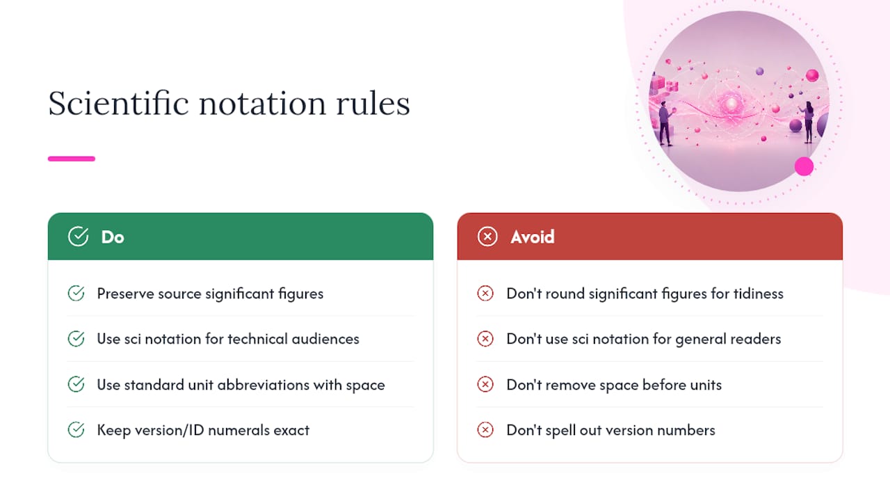
Significant figures matter more than the general rounding conventions used in trade writing. A measurement reported as “4.20 kg” carries a different precision claim than “4.2 kg,” the trailing zero signals that the measurement was taken to that level of accuracy, and dropping it changes the implied precision, not just the appearance. Technical writers should preserve the exact significant figures a source reports rather than rounding for tidiness.
Scientific notation (writing very large or very small numbers as a coefficient multiplied by a power of ten, such as 6.02 × 10²³) is standard in technical and scientific content but should be reserved for genuinely technical audiences. In general web content aimed at a broader readership, converting scientific notation into plain language or a rounded figure usually serves the reader better, unless the precision itself is the point being made.
Units and their abbreviations follow international convention rather than house style preference: “kg,” “km,” “°C” stay as standard abbreviations rather than being spelt out, and a space separates the number from the unit (“5 kg,” not “5kg”), consistent with the nonbreaking space guidance covered earlier for web formatting. Version numbers and technical identifiers (software versions, model numbers) are never spelt out and never rounded, they’re treated the same way as identification numbers: exactly as issued, numerals throughout.
Why consistent number style is worth the effort
Inconsistent number formatting is one of those errors readers notice without being able to say why something feels off. A page that writes “5 items” in one paragraph and “five items” three lines down reads as sloppy even to readers who couldn’t name the rule being broken.
Editorial teams that maintain style guides for web content tend to treat number formatting as a contract with the reader, not a matter of taste. Consistency within a document outweighs any single external rule, and that principle holds whether you’re maintaining a single blog or a multi-author publication with dozens of contributors. Readable, predictable formatting builds quiet trust, the kind that shows up in bounce rates and repeat visits rather than comments.
— Website
Catching inconsistent numbers before readers do
Manual proofreading catches obvious typos but tends to miss the slower drift, one writer spelling out “seven,” another using “7” three paragraphs later, that builds up across a site over months. Websitespellchecker exists for exactly that gap: it scans entire websites in one pass and flags formatting inconsistencies a single human editor would need hours to spot across dozens of pages.
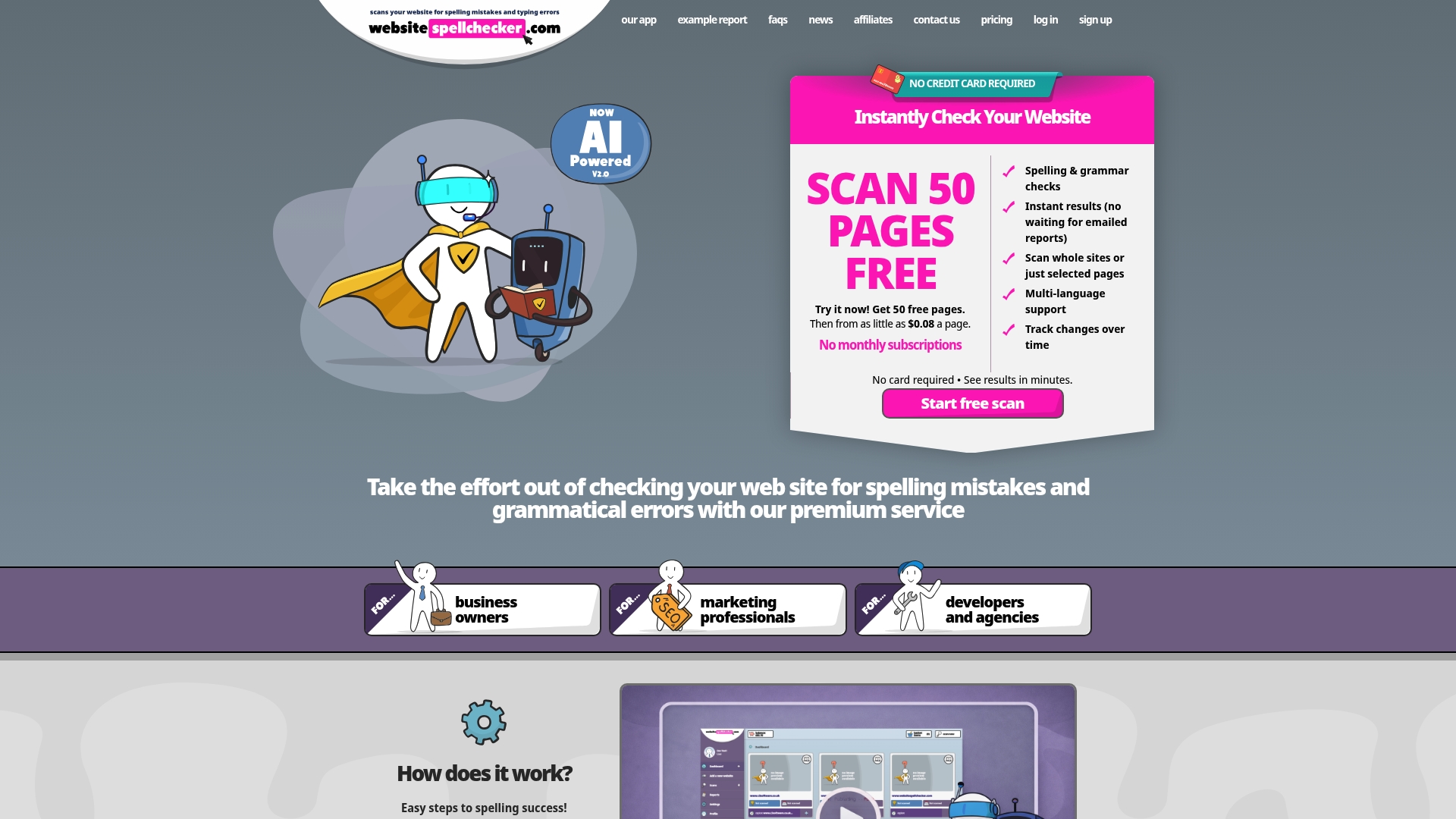
The tool tracks changes over time, so once you’ve documented your house-style rules for numbers, you can run scans on a schedule and see exactly where new content has drifted from the standard, whether that’s a stray superscript ordinal, an inconsistent thousands separator, or a percentage written out as a word where every other page uses the symbol. It’s built for the teams described in this guide’s checklist section: marketing professionals managing multiple contributors, developers maintaining documentation, and agencies checking client sites before launch. Start with a scan of your homepage through the website spellchecker for marketing professionals page to see how many number-format inconsistencies are already live.
Where to check the original rules
For primary guidance beyond this article, consult Microsoft’s style guide for web and technical rules, APA Style for academic numeral conventions, and the Chicago Manual of Style for its long-standing spell-out-through-one-hundred approach. Purdue OWL and the GPO style manual offer further comparison points for academic and government writing respectively.
Sources
- Numbers - Microsoft style guide
- NIH style guide — numerals
- APA Style — numbers expressed in numerals