UX writing guidelines: rules every product team can use today

UX writing is design with words: every button, error and label is a design decision, not decoration. The guidelines that matter most are simple: write with clarity, cut every unnecessary word, keep terminology consistent across screens, make text work for assistive technology, and test your copy the same way you test any other interface element.
You’ll find the full breakdown below, but here’s what to apply right now:
- Clarity first — say what happens next, in plain words, before anything else.
- Concision — button labels should run to one to three words; helper text should earn its place or go.
- Consistency — one word per concept, one tone per brand, documented in a shared terminology list.
- Accessibility — labels must make sense read aloud, with no reliance on colour or position.
- Test it — treat microcopy as a hypothesis, not a guess.
Component-level rules for buttons, errors, empty states and links follow further down, along with a governance model and a starter checklist you can run this week.
Key Takeaways
Good UX writing works because it treats every word as a tested design decision, not a final polish step.
| Point | Details |
|---|---|
| Lead with clarity | Frontload meaning and use active voice so users understand action before detail. |
| Cut ruthlessly | Keep button labels to one to three words and remove helper text that repeats the label. |
| Standardise terms | Maintain one terminology database so “delete” never becomes “remove” on another screen. |
| Write for every reader | Follow WCAG and ARIA guidance so labels work independently of colour, icons or position. |
| Maintain consistency at scale | Use Websitespellchecker to scan releases for spelling and grammar regressions between content audits. |
Table of Contents
- What is UX writing and where does it fit in product work?
- Core UX writing principles: clarity, concision and consistency
- What’s the difference between voice and tone in UX writing?
- How do you write microcopy for buttons, errors and empty states?
- How does accessibility shape inclusive UX writing?
- How do you embed UX writing into the design process?
- How do you measure whether UX copy is working?
- What belongs in a UX writing style guide?
- Ready-to-use UX writing examples and templates
- Localisation and internationalisation in UX writing
- Why microcopy deserves the same rigour as any other design decision
- Keep your UX copy error-free as you scale
- Frequently asked questions
- Sources
What is UX writing and where does it fit in product work?
UX writing is the practice of crafting the words inside a digital product: button labels, error messages, empty states, onboarding prompts, tooltips, confirmation screens. It sits inside interaction design, not inside the marketing department. Where marketing copy persuades someone to sign up, UX writing helps someone who has already signed up complete a task without friction or confusion.
Content strategy sets the broader rules (voice, taxonomy, governance); UX writing applies those rules at the screen level, word by word. The two disciplines overlap but answer different questions: content strategy asks “what should this product say and why”, UX writing asks “what does this specific button need to say right now”.
Writers add the most value when they’re pulled in early rather than handed a finished screen to caption. Useful entry points include:
- Discovery and research, to understand the user’s mental model before any screen exists.
- Wireframing, where word count and label length shape the layout itself.
- Design review, to catch inconsistent terminology before development starts.
- QA and release, to catch copy regressions before they ship.
Core UX writing principles: clarity, concision and consistency
Most UX writing guidelines collapse into three operating pillars, and each one has testable heuristics behind it rather than vague aspiration.
Clarity means frontloading meaning. Put the most important word first in any sentence, label or heading, because users scan rather than read. “Delete this file permanently” beats “This action is permanent and cannot be undone, so please be careful before deleting this file.” Active voice does the same job: “We couldn’t save your changes” is faster to process than “Your changes could not be saved.” Cut jargon a new user wouldn’t recognise, including internal engineering terms that leaked into the interface.
Concision is the discipline of removing anything that doesn’t change what the user does next. UX Writing Hub’s guidance defines conciseness as stripping every word that adds no immediate value, and recommends button labels of one to three words: “Save changes”, not “Click here to save your changes to this document.” Apply the same edit to helper text under form fields: if a sentence just restates the label, delete it.
Consistency stops users relearning your product on every screen. Pick one term per concept and never swap it, whether that’s “delete” versus “remove”, or “sign in” versus “log in”. A shared terminology database, covered later in this guide, is what actually enforces this at scale rather than relying on memory.
To apply the three pillars when editing an existing screen:
- Read the copy aloud. If you stumble, a real user will too.
- Cut the sentence in half, then check if the meaning survives.
- Compare the term against your terminology list; if it doesn’t match, change the copy, not the list.
- Check punctuation and casing against your style guide (sentence case is now the near-universal default across interfaces).
- Ask whether the copy would still make sense with no icon or colour next to it.
Pro Tip: *Print the screen and cross out every word with a pen. Whatever survives the cut is the copy you actually needed.
What’s the difference between voice and tone in UX writing?
Voice is your product’s personality, and it stays fixed. Tone is how that personality flexes depending on what the user is going through in that moment, and it should change constantly. A brand that sounds confident and warm during onboarding should sound calm and precise during a payment failure, not chirpy. NN/g’s research on UX writing frames voice as the stable identity underneath tone’s situational adjustments.
The practical tool for managing this is a tone matrix: a table mapping user states to acceptable tone ranges and example copy, so no single writer has to reinvent the decision every time. A basic version covers:
- Onboarding — encouraging, brief, forward-looking (“Let’s get your account set up”).
- Success states — warm but not overdone (“Saved. You’re all set.”).
- Errors — calm, specific, blame-free (“We couldn’t process that payment. Check your card details and try again.”).
- Security-sensitive flows — direct and serious, no jokes, no exclamation marks (“Your session has ended for your security. Sign in again to continue.”).
Document these decisions once, with real examples of copy that got it right and copy that got it wrong, and store the matrix alongside your voice definition. Our guide to brand tone of voice walks through building one from scratch if you’re starting without any documented rules at all.
How do you write microcopy for buttons, errors and empty states?
Component-level copy is where UX writing guidelines earn their keep, because these are the moments users interact with most often and forgive least.

Buttons follow a verb plus object pattern: “Add card”, “Delete file”, “Send invite”. Avoid vague defaults like “Submit” or “OK” whenever a more specific label fits, since specific labels reduce hesitation and mis-clicks. UX Writing Hub recommends keeping button labels to one to three words wherever the action allows it.
Field labels and validation should frontload the requirement rather than bury it in a tooltip: “Password (8+ characters)” beats a generic “Password” with a hidden rule that only surfaces after a failed attempt. When validation fails, explain why and show the fix in the same message, not two separate ones.
Error messages work best with three parts in this order: a plain headline stating what happened, a brief reason, and a recovery action. “Payment failed. Your card was declined by your bank. Try a different card or contact your bank.” Never blame the user (“You entered an invalid amount”) when the system’s own constraint caused the problem.
Empty states should give one primary action rather than a wall of options: “You haven’t added any projects yet. Create your first project.” Success messages should confirm what happened and, where useful, hint at the benefit: “Invite sent. Your teammate will get an email shortly.”
Links should describe the destination, not the mechanism: “View pricing plans” rather than “Click here.” Tooltips exist for genuinely supplementary detail, not for information a user needs to complete the task, which belongs in the main copy instead.
| Component | Rule | Example |
|---|---|---|
| Button | Verb + object, 1–3 words | “Send invite” |
| Field label | Frontload the requirement | “Password (8+ characters)” |
| Error message | Headline + reason + recovery | “Payment failed. Card declined. Try another card.” |
| Empty state | One primary action | “No projects yet. Create your first project.” |
| Link text | Name the destination | “View pricing plans” |
Design systems such as PatternFly publish component-level writing patterns along these same lines, which is worth borrowing from rather than reinventing per project. Our own website microcopy examples collect real screen-level copy across these component types if you want a working reference library.
How does accessibility shape inclusive UX writing?
Accessible copy isn’t a separate workstream bolted onto UX writing at the end. It’s the same discipline of clarity applied to a screen reader instead of a pair of eyes. NN/g’s guidance is blunt about the most common failure: instructions that only work visually, such as “click the red button below,” which mean nothing to someone using a screen reader or someone with colour blindness.
The W3C’s WCAG and ARIA standards set the baseline for how labels and roles should be structured so assistive technology can interpret them correctly, and they’re worth treating as a checklist rather than background reading:
- Write labels that describe function, not position (“Search” rather than “the icon on the top right”).
- Use ARIA attributes to give programmatic names to icon-only controls that have no visible text label.
- Keep alt text specific and short; describe what the image communicates, not every visual detail.
- Avoid idioms and culturally specific phrasing that won’t translate cleanly or make sense to every reader.
- Write to a reading level that doesn’t assume native fluency or specialist vocabulary.
Screen reader users typically hear interface text read aloud in a flat, linear stream with no visual hierarchy to lean on, which is exactly why frontloaded, jargon-free copy matters as much for accessibility as it does for scannability. A label that only makes sense next to a specific icon or colour has already failed a portion of your audience before a sighted user even notices the problem. Pairing your copy audit with a tool like our WordPress accessibility checker catches structural issues that copy review alone won’t surface.
How do you embed UX writing into the design process?
Copy fixed at the end of a project is copy fixed under time pressure, usually by whoever’s left in the room. Fixing that means changing when writers get involved, not just how much they write.
- Bring writers into discovery, before wireframes exist, so word count and terminology shape the structure rather than get squeezed into it afterwards.
- Draft copy inside the design file itself, not in a separate document, so designers and writers see the same screen at the same time.
- Run paired writing sessions for high-stakes flows (checkout, account deletion, security alerts) where a single writer’s blind spot is a real risk.
- Set a content review as a sign-off gate, equivalent to a design review, before anything ships to engineering.
- Keep a content backlog separate from the feature backlog, so copy debt doesn’t quietly pile up behind feature work.
Material Design’s guidance treats words as a design material on the same level as layout or colour, worth deciding on during the design phase rather than patching in afterwards. If a screen is hard to explain in a sentence, that’s usually a sign the design itself needs rethinking, not just the copy sitting on top of it. Teams working across design and engineering disciplines see the same pattern; practical guidance on integrating copy into wireframes makes the case that collaboration rituals matter as much as any individual writer’s skill.
How do you measure whether UX copy is working?
Microcopy is testable the same way a checkout flow or a pricing page is testable. The KPIs worth tracking are task completion rate, conversion at the specific step you changed, and error recovery rate (how many users succeed on a second attempt after hitting an error message).
Run a small A/B test scoped to one component at a time: two versions of a single error message, or two button labels on the same screen, measured against completion rate over a defined window. Keep the scope narrow. Testing five copy changes at once tells you nothing about which one moved the number.
Qualitative checks matter just as much and cost far less:
- Run moderated sessions where you watch a real user hit the copy without prompting them.
- Do a read-aloud test yourself. If you trip over a sentence, a user will hesitate over it too.
- Run a periodic content audit, roughly every six to twelve months, to catch terminology drift that feature teams introduce without meaning to.
A website usability review is a practical way to structure this kind of audit if you don’t already have a process in place.
What belongs in a UX writing style guide?
A style guide only earns its place if teams actually open it, which means keeping it lean rather than exhaustive. The essential sections are voice and tone (with the matrix described earlier), a terminology list, annotated component examples, and your accessibility rules in one place rather than scattered across separate documents.
The terminology entry is the one that prevents the most damage day to day. A centralised terminology database, the kind Grafana’s Writers’ Toolkit and SAP’s design guidance both recommend, stops one team calling something a “reservation” while another calls it a “booking” on the very next screen.
Governance matters more than the document itself:
- Assign one clear owner for the style guide, even if multiple writers contribute to it.
- Set a review cycle (quarterly is common) rather than leaving updates to happen whenever someone remembers.
- Version the guide so teams can see what changed and when, the same way you’d version a design system.
Our web style guide walks through a structure you can adapt rather than build from a blank page.
Ready-to-use UX writing examples and templates
Templates save the most time on the screens every product repeats endlessly. A rejected payment: “Payment failed. Your card was declined. Try another card or contact your bank.” An empty inbox: “No messages yet. Once someone replies, you’ll see it here.” A destructive confirmation: “Delete this project? This can’t be undone.” Each one applies the same rule: headline first, reason or consequence second, recovery or next step last.
Annotate each template with the principle behind it (frontloading, active voice, one primary action) so a new writer joining the team understands the reasoning, not just the wording. Our website microcopy examples collection expands this into a fuller bank across more component types.
Localisation and internationalisation in UX writing
Copy that works in English rarely survives a direct translation. German button labels routinely run 30 to 40% longer than their English source, which breaks layouts built with English-length assumptions baked in. Right-to-left languages such as Arabic or Hebrew change how icons, alignment and even punctuation should sit relative to text, not just the direction of reading.
Idioms and culturally specific metaphors are the first thing to strip out if a product will ship in more than one language. “Hit the ground running” or “ballpark figure” mean nothing translated literally, and a good localisation process catches these long before a translator has to guess at intent.
A content matrix, mapping each phrase to its component, state and page, keeps localisation and any automated translation tooling working from a single consistent source rather than translating the same concept five different ways across five different screens. This is the same terminology discipline covered earlier, applied across languages rather than just within one.
Build in space for text expansion from the start of the design process rather than retrofitting layouts once translated copy arrives. A button designed to fit “Save” exactly, with no margin, will break the moment it needs to say “Enregistrer” or “Speichern.” Plan flexible containers, and test your highest-traffic flows in at least one longer target language before assuming your layout will hold.
Why microcopy deserves the same rigour as any other design decision
Most teams treat copy as the last five minutes of a design review, and it shows. Treat a single button label change as a legitimate experiment, worth measuring the same way you’d measure a layout change, and you’ll often find it moves completion rates more than a visual redesign would. Writing isn’t decoration sitting on top of the interface. It’s one of the levers that decides whether the interface works at all.
Keep your UX copy error-free as you scale
Getting the words right is only half the job. Keeping them right, across every page, every release and every new feature ships without a fresh typo or an inconsistent term slipping through, is the part most teams underestimate. That’s where Websitespellchecker earns its place in your workflow: it scans your entire site for spelling mistakes, grammar errors and inconsistent phrasing in one pass, instead of relying on someone manually rereading every screen before launch.
Run a scan before each release and you catch the small regressions that content audits miss between their scheduled six to twelve month cycles, the stray “recieve” in an error message or a leftover “Log In” where the rest of the product now says “Sign in.” Reports come back instantly and download as a shareable PDF, so a product manager or reviewer can act on findings without needing platform access themselves. It fits naturally into an audit, rewrite, ship cycle: your team handles the voice, tone and structural rewrites covered above, and a scan built for teams shipping regularly handles the ongoing consistency check in between. Start with a free scan of your highest-traffic flows and see what it turns up before your next release.
Frequently asked questions
What are the most important UX writing guidelines to follow? Clarity, concision and consistency form the foundation: frontload meaning, cut every word that doesn’t change the user’s next action, and use one term per concept across the whole product. Accessibility and regular testing sit alongside these as non-negotiable checks, not afterthoughts.
How is UX writing different from copywriting? Copywriting persuades someone to take an action they haven’t committed to yet, such as signing up or buying. UX writing helps someone who has already committed complete a task, whether that’s resetting a password or confirming a delivery address, with as little friction as possible.
How long should button labels be? One to three words in most cases, following a verb plus object structure such as “Save changes” or “Add card”. Longer labels usually signal that the action itself needs breaking into a clearer, simpler step.
How often should a UX writing style guide be reviewed? A quarterly review cycle keeps most style guides current, paired with a fuller content audit every six to twelve months to catch terminology drift that individual feature teams introduce without noticing.
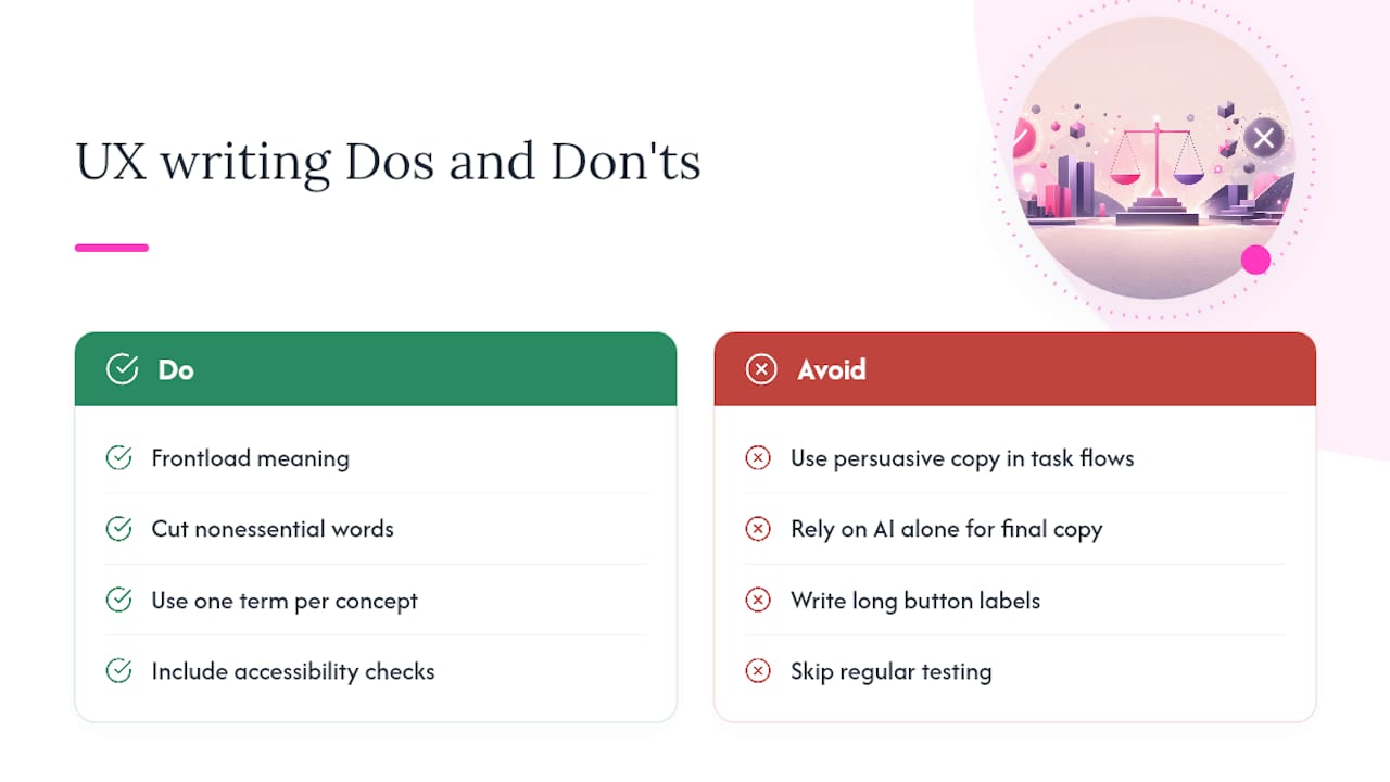
Can AI write UX copy on its own? AI tools can help generate variants quickly, but they tend to drift from brand voice and struggle with emotionally charged moments like payment failures or account deletion. High-stakes messages still need a human writer to draft the final version and choose the recovery language.
Sources
- UX Writing Best Practices: Your Definitive Guide to Crafting User-Centered Content
- UX Writing: Study Guide
- Material’s Communication Principles: Intro to UX Writing
- PatternFly • UX writing best practices