Website microcopy examples: 60+ tested templates and tips

Microcopy is the short, functional text that guides users through an interface: a button label, an error message, a tooltip. It sits at fewer than three sentences and carries more persuasive weight than most product copy twice its length. The best website microcopy examples follow three rules from Nielsen Norman Group’s 3 C’s framework: Clarity first, Concision second, Character last.
- Clarity: the user knows exactly what happens next.
- Concision: no word is wasted.
- Character: brand voice adds warmth without clouding meaning.
Keep those three rules in your head as you read through the examples and templates below. Every annotated example maps back to at least one of them.
Key takeaways
Effective microcopy follows three rules in order: Clarity, Concision, then Character, applied consistently across every UI element from buttons to error messages.
| Point | Details |
|---|---|
| Apply the 3 C’s in order | Fix clarity first, then cut words, then add brand voice — never reverse the sequence. |
| Use verb + object labels | Replace “Submit” with specific labels like “Save changes” or “Reserve my spot” to lift completion rates. |
| Write errors as what–why–how | Tell users what went wrong, why, and exactly how to fix it — vague errors drive abandonment. |
| Accessibility is non-optional | Visible labels, pre-field instructions, and ARIA-live regions are required for WCAG compliance, not optional extras. |
| Websitespellchecker as QA gate | Run an automated site-wide scan before each release to catch copy errors that manual review misses. |
Table of Contents
- What counts as microcopy and where it lives in your interface
- Why microcopy affects UX and your business metrics
- Main microcopy types and when to use each
- Real-world website microcopy examples, annotated by type
- A practical framework: the 3 C’s plus accessibility and tone rules
- How to write microcopy inside a product workflow
- How to measure microcopy impact: A/B tests, KPIs and qualitative signals
- Ready-to-use microcopy templates you can copy and adapt
- The part of microcopy most teams underestimate
- Microcopy QA belongs in your pre-release checklist
- Sources
What counts as microcopy and where it lives in your interface
Nielsen Norman Group classifies microcopy as the smallest copy size in a product: fewer than three sentences, written to guide a specific interaction rather than to inform or persuade at length. Short-form copy runs to two or three paragraphs; long-form runs beyond that. Microcopy sits below both.
You will find it in these spots:
- Buttons and CTAs (“Save changes”, “Start free trial”)
- Form field hints and placeholder text (“Enter your work email”)
- Inline validation and error messages (“That password needs at least 8 characters”)
- Tooltips and helper text (the “?” icon next to a field label)
- Cookie and consent banners (“We use cookies to improve your experience”)
- 404 and empty-state messages (“Nothing here yet — add your first project”)
- Progress and status indicators (“Step 2 of 4: Confirm your details”)
- Onboarding nudges and confirmation messages (“You’re all set. Check your inbox.”)
The distinction that matters: microcopy is contextual. It only makes sense attached to a specific UI element. Pull it out of context and it loses meaning. That is what separates it from a tagline or a product description, and it is why treating microcopy as a separate marketing artefact tends to produce copy that sounds polished but confuses users in the moment.
Why microcopy affects UX and your business metrics
Small text, large consequences. A single word change on a button can shift completion rates measurably, and a poorly worded error message can send a user straight to a competitor.
The UX outcomes that microcopy directly influences:
- Error prevention: clear field labels and inline hints stop users from submitting incorrect data in the first place.
- Error recovery: a message that explains what went wrong and how to fix it cuts support tickets and keeps users in the flow.
- Trust: reassurance copy near a payment button (“Your card details are encrypted”) reduces abandonment at the highest-friction moment.
- Conversion: ecommerce microcopy patterns such as stock-state labels (“Only 3 left”) and returns reassurance (“Free returns within 30 days”) placed near CTAs reduce cart abandonment.
- Time-on-task: users who understand what a field expects complete forms faster.
KPIs worth tracking when you change microcopy: conversion rate, form completion rate, error rate on specific fields, support ticket volume for a given flow, cart abandonment rate, and time-on-task from session recordings. Qualitative signals, such as user comments in moderated tests or recurring themes in support transcripts, often surface the problem before the numbers do.
Main microcopy types and when to use each
Microcopy falls into three broad categories. The table below maps each to its typical placement, primary goal, and a quick example.
| Type | Typical placement | Primary goal | Quick example |
|---|---|---|---|
| Interaction | Buttons, links, CTAs | Trigger an action | “Save and continue” |
| Informational | Tooltips, field hints, progress bars | Reduce uncertainty | “We’ll only email you about your order” |
| Influential | Error messages, empty states, confirmations | Change or recover behaviour | “Looks like that email is already registered. Sign in instead?” |
Interaction microcopy covers every label that asks the user to do something. The risk here is vagueness: “Submit” tells the user nothing about what they are submitting or what happens next.
Informational microcopy reduces cognitive load at decision points. A tooltip explaining why you need a phone number, or a progress indicator showing “Step 2 of 4,” keeps users oriented without requiring them to read a help article.
Influential microcopy is the most nuanced. Error messages, empty states, and confirmation copy all appear at moments of friction or uncertainty. Done well, they recover the user. Done poorly, they blame the user and lose them. Smashing Magazine’s guidance on UX writing pitfalls calls the opposite of this “UI explanation syndrome”: copy that describes how to operate a control rather than what happens when you do.
Real-world website microcopy examples, annotated by type
CTA and button labels
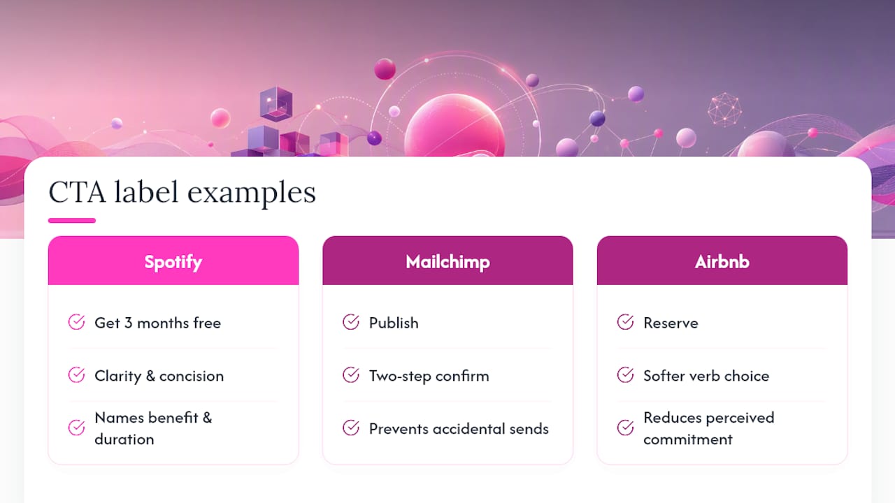
Spotify: “Get 3 months free” rather than “Start trial.” The copy names the specific benefit and the duration. It applies Clarity (you know what you get) and Concision (four words). The character is neutral but the specificity does the persuasive work.
Mailchimp: “Publish” on the campaign send button, with a secondary confirmation screen that reads “Your campaign is on its way!” The two-step pattern separates the action from the celebration, preventing accidental sends while rewarding completion.
Airbnb: “Reserve” instead of “Book now.” The softer verb reduces perceived commitment at the point of highest anxiety in the booking flow. A small word choice, a measurable drop in drop-off.
Do: Use verb + object (“Save changes”, “Download report”, “Reserve your spot”). Don’t: Use “Click here” or “Submit” with no context.
Error messages
Slack: When a workspace URL is already taken: “That URL is taken. Try [yourcompany]-team or [yourcompany]-hq.” It follows the what–why–how structure and offers specific recovery suggestions rather than leaving the user to guess.
Grammarly: On a failed login: “Hmm, that password doesn’t match. Try again or reset it below.” The “Hmm” adds a tiny human touch without obscuring the recovery path. Character in service of Clarity.
Do: Write errors as what happened, why, and how to fix it. Don’t: Write “An error occurred. Please try again.” That tells the user nothing actionable.
Form field hints and inline validation
Starbucks (rewards sign-up): “Your birthday lets us send you a treat. We won’t share it.” Two sentences. The first explains the value exchange; the second removes the privacy concern. Both are necessary; neither is surplus.
Adobe (Creative Cloud sign-up): Password field hint reads “8 or more characters, including a number.” Visible before the user types, not after they fail. That timing shift alone prevents the most common form error.
Do: Show field hints before the user makes a mistake. Don’t: Reveal requirements only in the error state.
Empty states
Flickr: On an empty photo stream: “You haven’t uploaded any photos yet. Start sharing your world.” The first sentence acknowledges the state; the second gives a reason to act. The phrasing “your world” adds character without sacrificing clarity.
Basecamp: On an empty project list: “No projects yet. Ready to start something?” The question mark makes it feel like an invitation rather than a system status. It also implies the user is in control, which reduces anxiety in a new tool.
Onboarding nudges
Slack (first-time channel view): “This is the very beginning of the #general channel.” A single sentence that orients the user without explaining how Slack works. It trusts the user to figure out the interaction; it only provides the context they need.
Mailchimp (empty audience): “Your audience is waiting. Add your first contact to get started.” The phrase “your audience is waiting” reframes an empty state as potential rather than absence, which is a subtle but effective motivational shift.
Cookie and consent banners
A common failure: “We use cookies to enhance your experience. Accept or decline.” The word “enhance” is vague and the choice feels binary. A better version: “We use cookies to remember your preferences and measure how our site is used. You can manage your choices below.” Specific, honest, and gives the user a sense of control.
Pro Tip: On consent banners, name what the cookies actually do. “Measure how our site is used” is more trustworthy than “improve your experience” because it is verifiable.
404 pages
Basecamp’s 404 reads: “Oops, we can’t find that page. It may have moved or been deleted. Head back home or search for what you need.” Three short sentences. The first acknowledges the error without blame; the second offers a plausible explanation; the third gives two recovery paths.
A practical framework: the 3 C’s plus accessibility and tone rules
Clarity, Concision, Character in practice
NN/g’s 3 C’s framework is the most practical evaluation tool available for microcopy. Apply them in order: if a piece of copy is unclear, fix that first before worrying about whether it sounds like the brand.
Clarity means the user knows what happens next. Test it by asking: “If I read only this label, do I know what this button does and what I get?” If the answer is no, rewrite.
Concision means removing every word that does not carry meaning. “Click the button below to proceed to the next step” becomes “Continue.” But concision does not mean terse to the point of confusion: “Save” is fine; “OK” on a destructive action is not.
Character is where brand voice lives. Mailchimp’s “You did it!” confirmation, Slack’s “Hmm” on a failed login, Flickr’s “your world” in an empty state. These work because they appear at low-stakes moments where the user is not trying to make a decision. Reserve character for celebrations and reassurances, not for instructions.
Accessibility checklist
WCAG’s input assistance guidance sets the baseline for accessible microcopy. The practical items for your review:
- Every form field has a visible label (not just placeholder text, which disappears on focus).
- Instructions appear before the field, not only in the error state.
- Error messages identify the field, describe the problem, and suggest a fix.
- Success confirmations are announced to screen readers (use
aria-liveregions for dynamic updates). - Tooltips are keyboard-accessible and do not rely solely on hover.
A note on promotional microcopy and disclosure
Where microcopy carries a promotional claim (“Free for 30 days”, “No credit card required”), the claim must be accurate and any material conditions must be visible near the CTA. Placing “Terms apply” in a footer while the button reads “Free forever” creates a legal and trust risk. The Shopify enterprise blog’s ecommerce examples show how to place returns and promotion terms adjacent to the CTA rather than buried elsewhere.
Pro Tip: Write a one-page voice and tone guide for your product. It takes two hours and prevents six months of inconsistent copy across teams.
How to write microcopy inside a product workflow
Good microcopy rarely comes from one person working alone. It needs a short, repeatable process.
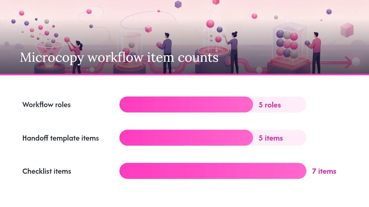
Roles:
- UX writer (or designer doubling up): drafts the copy, owns the voice and tone guide.
- Product manager: confirms the copy matches the intended user action and business goal.
- Accessibility reviewer: checks labels, error messages, and dynamic text against WCAG criteria.
- Localisation reviewer: flags idioms, character limits, and placeholders that will not translate cleanly.
- Legal reviewer: clears promotional claims and disclosure copy.
Handoff template (what to include in a ticket):
- The UI element and its state (e.g. “Password field, error state, wrong password entered”).
- The copy string, including any dynamic variables (e.g. “That email, {email}, is already registered”).
- The character limit (if one exists).
- The ARIA label or
aria-describedbyreference. - The localisation note (e.g. “Date format varies by locale — use ISO 8601 in the variable”).
Seven-item checklist for every microcopy change (adapted from the UX writing checklist essentials):
- The label is action-specific (verb + object, not “Submit”).
- The copy covers one idea per element.
- There is a testable acceptance criterion (“Error message appears within 500ms of failed validation”).
- An accessibility note is attached (ARIA label, live region, or keyboard behaviour).
- Localisation variables are marked and character limits are documented.
- Any promotional claim has been cleared by legal.
- An owner is named for post-launch monitoring.
Avoid UI explanation syndrome at the review stage: if a reviewer’s feedback is “explain how the button works,” push back. The copy should describe the outcome, not the mechanism.
How to measure microcopy impact: A/B tests, KPIs and qualitative signals
Microcopy is one of the lowest-cost, highest-signal areas to test. A single-word CTA change requires no design work and minimal engineering time, yet it can shift conversion rates at a statistically meaningful level. Small A/B tests on microcopy are a practical way to move from opinion to evidence without heavy release cycles.
A/B test ideas worth running
- Button label variants: “Get started” vs “Start free trial” vs “Create my account.” Measure click-through rate and downstream completion rate, not just clicks.
- Error message recovery: “Invalid email” vs “That doesn’t look like an email address. Try name@example.com.” Measure re-submission rate and time-to-correct.
- Empty-state CTAs: “No projects yet” vs “No projects yet. Create your first one in 30 seconds.” Measure the rate at which users take the prompted action.
- Reassurance copy near payment: adding “Cancel any time” below a subscription CTA. Measure conversion rate on that step.
KPIs and when to prefer qualitative signals
Primary KPIs: conversion rate on the tested element, form completion rate, error rate on specific fields, support ticket volume for the affected flow, and cart abandonment rate.
Qualitative signals are often faster to act on. Session recordings show where users pause, re-read, or abandon. Moderated usability tests surface confusion that metrics cannot explain. Support ticket analysis reveals which error messages users cannot recover from on their own. A website usability review that combines both quantitative and qualitative data gives you the clearest picture.
Experiment design tips
Run tests until you reach statistical significance, not just until the trend looks good. Instrument the full funnel, not just the element you changed, because microcopy changes can shift behaviour several steps downstream.
Ready-to-use microcopy templates you can copy and adapt
CTA and button labels
Neutral voice:
- “Save changes”
- “Continue to payment”
- “Download your report”
- “Create account”
Helpful voice:
- “Save and I’ll remind you later”
- “Yes, send my free guide”
- “Reserve my spot”
Playful voice (use only at low-stakes moments):
- “Let’s go!”
- “I’m in”
- “Show me the magic”
Accessibility variant: always pair a button label with an aria-label when the visible text is short and context-dependent. “Delete” becomes aria-label="Delete project: Q4 Campaign".
Error messages (what–why–how structure)
- “That email is already registered. [Sign in] or [reset your password].”
- “Your password needs at least 8 characters, including one number.”
- “We couldn’t process your payment. Check your card details and try again, or [use a different card].”
- “Session timed out after 30 minutes of inactivity. [Sign in again] to continue where you left off.”
Form field hints
- “Use the email address linked to your account.”
- “Your phone number is only used to send order updates.”
- “Password: 8+ characters, one number, one symbol.”
- “Company name as it appears on your invoice.”
Empty-state prompts
- “Nothing here yet. to get started.”
- “Your {list name} is empty. Once you add {items}, they’ll appear here.”
- “No results for ‘{search term}’. Try a shorter search or [browse all {category}].”
Confirmation messages
- “Done! Your changes have been saved.”
- “You’re on the list. Check your inbox for a confirmation.”
- “Order placed. You’ll receive a tracking link within 24 hours.”
- “Account deleted. We’re sorry to see you go. [Changed your mind?]”
Localisation placeholders: wrap dynamic values in curly braces ({item}, {email}, {date}) and document the expected format for each locale in your handoff ticket. Date formats, currency symbols, and plural rules all vary and will break copy that looks fine in English.
For onboarding flows specifically, research into why users abandon apps during onboarding shows that unclear progress signals and vague next-step prompts are among the top causes of early drop-off. The templates above address both.
The part of microcopy most teams underestimate
Most product teams treat microcopy as the last thing to write and the first thing to cut when a sprint runs long. That is the wrong order of priority.
The copy on a “Submit” button is seen by every user who reaches that step. A homepage hero headline is seen by many, but most visitors never reach the checkout or the sign-up form. Microcopy sits at the highest-traffic moments in a product, which means even a small improvement compounds across every session.
The other underestimated factor is consistency. A product where buttons say “Save” in one flow and “Update” in another, where errors say “Invalid input” on one form and “Please check your entry” on another, erodes trust quietly. Users do not consciously notice the inconsistency, but they feel it as friction. A one-page voice and tone guide, reviewed at the same time as the design system, prevents most of this.
The brands that do this well, Slack, Mailchimp, Basecamp, share one habit: they treat microcopy as a design material, not a copywriting afterthought. It gets the same review rigour as a component, the same version control, and the same accessibility check. That discipline is what makes their copy feel effortless to users.
Microcopy QA belongs in your pre-release checklist
Writing great microcopy is only half the work. Keeping it clean across a site that grows and changes is where most teams slip. A typo in a button label, a broken placeholder in an error message, or an inconsistent term that crept in during a rushed sprint can chip away at the trust your copy worked to build.
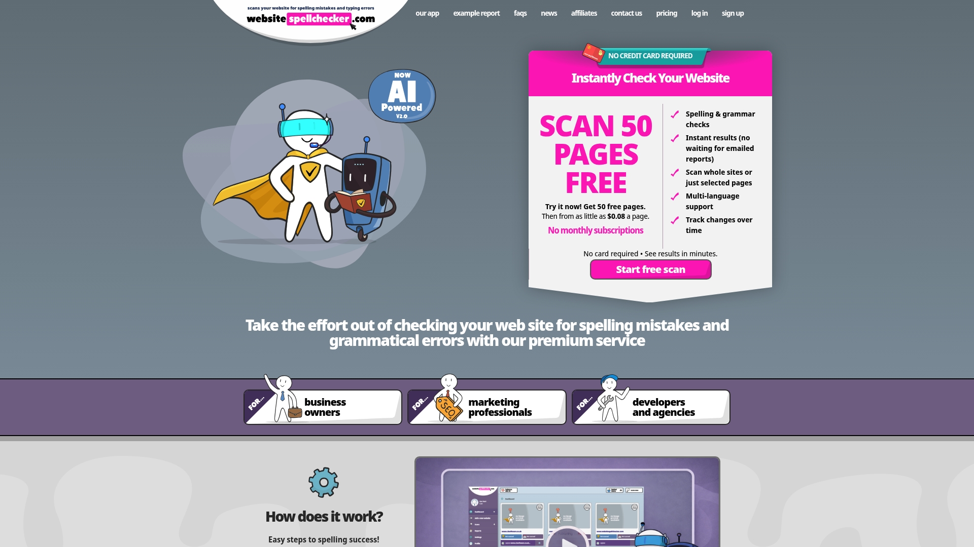
Websitespellchecker scans your entire site automatically, catching spelling mistakes, grammatical errors, awkward phrasing, and inconsistent terminology across every page in one go. It tracks changes over time, so you can see when new errors appear after a release, and produces a downloadable PDF report you can share with your team or a client. For marketing professionals managing copy quality at scale, it fits naturally as the final QA gate before any launch. You can run a free site-wide scan today and see exactly where your microcopy needs attention, with no subscription required.